Note: This post contains affiliate links. I may receive a small commission (at no extra cost to you) if you click a link and make a purchase.
Are you ready to see some refreshed Wayward quilt mock-ups? Wayward is my new jelly roll pattern released earlier this week. If you missed that, you can read about the cover quilt HERE, about a second sample quilt and how the name came to be HERE, or about a two-color version HERE.
But if you need even more inspiration for your own Wayward quilt, this is the post for you! I picked a few of my favorite recent fabric collections and refreshed Wayward with them. Let's jump right in!
But first, I want to mention something about these mock-ups. With the way the blocks are constructed, certain fabric combinations show up together multiple times within the quilt. However, that became way too hard to keep track of when coloring these digital images so I often just randomly assigned fabrics to various patches within the quilt. It shouldn't change the overall look of the quilt, but wanted to mention that in case you try to replicate my image exactly. You won't be to match the exact fabric placements shown here.
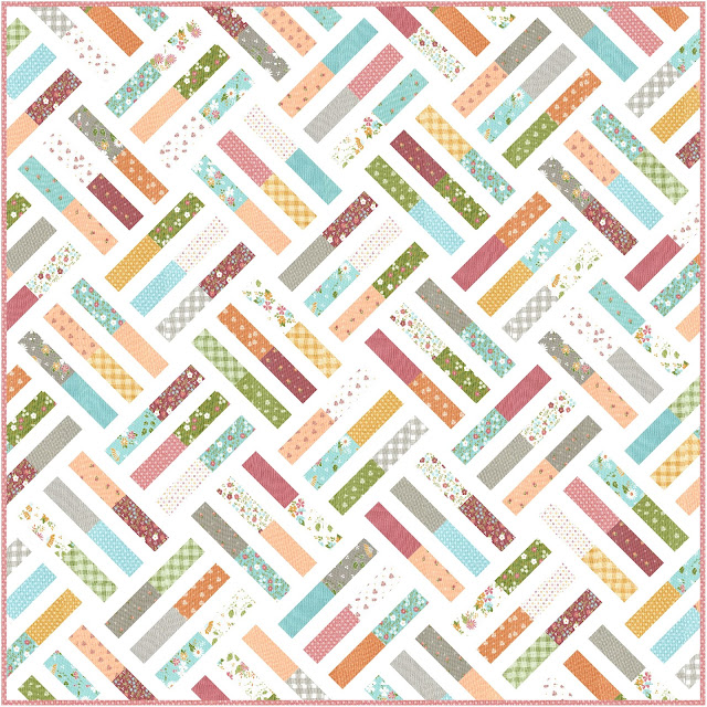
Okay, on to the quilts! First, I played around with Bountiful Blooms, the latest collection from Sherri and Chelsi to arrive in quilt shops.
One of the things I love about Bountiful Blooms is that it feels like a combination of summer and fall. It feels a little too bright and cheery to be a fall fabric line, but it also feels a little darker and more muted that what you might expect for a summer quilt. This is the perfect fabric collection if you're ready to shift into those cooler autumn months but aren't quite ready to say goodbye to summer yet!
Background fabric can also make a difference in how a quilt "feels." The first mock-up below has a bright white background and maybe leans more towards a summer feel.
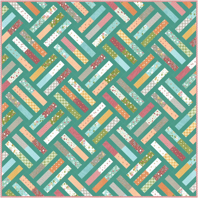
Then I switched to a teal background for the second mock-up and to me, this gives it a warmer, start-of-fall feel. The teal I used is one of the solids that Sherri and Chelsi have picked to coordinate with the Bountiful Blooms collection. I used Betty's Teal (Bella Solid 9900-126) in this mock-up.
I actually bought some of this solid recently because I'm planning to use Bountiful Blooms in a future pattern sample. It's lighter in real life than the digital image. The blues in the collection do not contrast as much as they appear to digitally. I'm debating buying some of a darker teal called Pond (Bella Solid 9900-109) to see if I like it better. Just a heads up if you want to make this version.
The next fabric collection that I chose is Lighthearted by Camille Roskelley. While Camille may be designing on her own now since her mom, Bonnie retired, this collection definitely feels like classic Bonnie and Camille.
When I created this mock-up, I loved it so much that I almost bought fabric to make this! I managed to stop myself because I already have two other Wayward quilts planned in addition to the three I've already made and I have too many other quilts waiting to be finished. It's hard though! I'll just have to enjoy this digital version.
I used a cream print with little red hearts from the Lighthearted collection for the background and I think it looks so cute!
Next up is a Christmas Wayward quilt refreshed with Wintertale by Katarina Roccella for Art Gallery Fabrics. You would want to use a fat quarter bundle for this version. I used the white print with little stars for the background but that print is getting hard to find. There are a few available on Etsy at the moment (the link brings up more than just that print, just FYI). If you can't find it, I think this would look just as good with a solid white background.
Another recent fabric collection that I can't get enough of is the group of 20 new Art Gallery Signature Pure Solids curated by Suzy of Suzy Quilts. I am currently obsessed with this color palette! I may have several future quilt samples planned with these fabrics. We'll see how many become reality, ha! In the meantime, if you love these colors as much as I do, you might decide to use them to make a Wayward quilt. You could use the fat quarter or quarter yard options in the pattern.
I couldn't decide what color I liked best for the background, so I'm sharing several. Except for the bright white one, each background color is one of the solids from the collection. You only need 11 colors for the main fabrics and there are 20 in the collection so you can pick a background color and then choose 11 colors that contrast with that. I've named the background color used in each mock-up below in the caption to the photo.
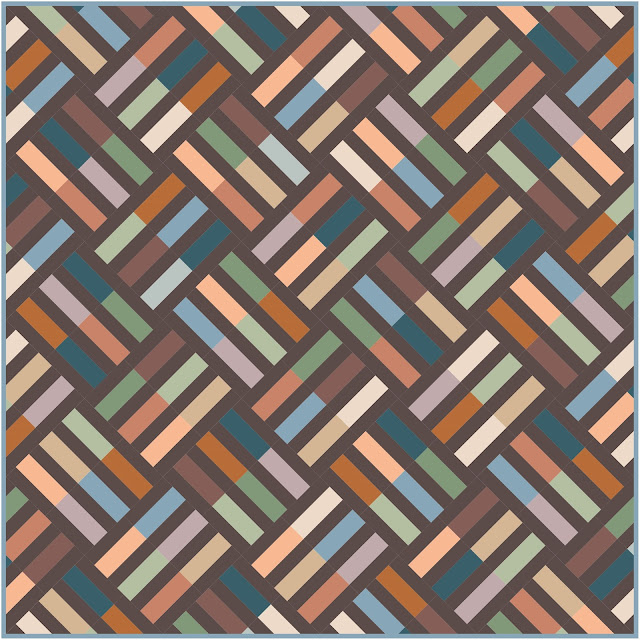 |
| Driftwood |
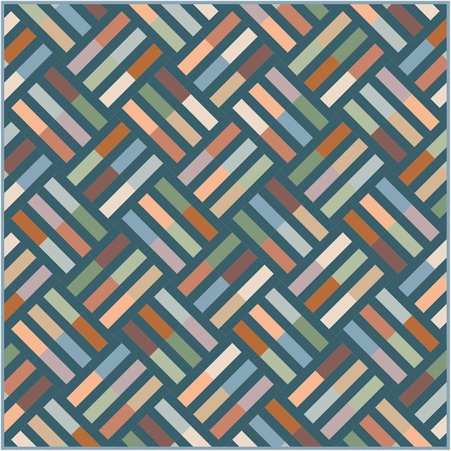 |
| Honeymoon |
 |
| Pearl |
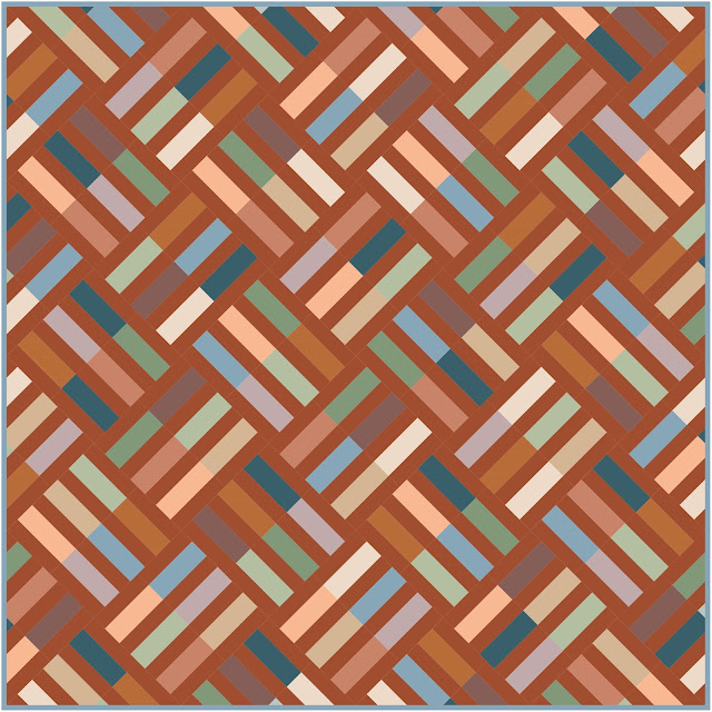 |
| Poppy |
 |
| Velvet |
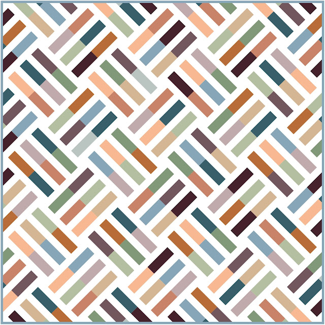 |
| Snow (AGF Pure Solid) |
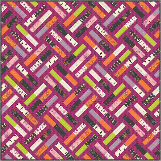
The last collection that I'm featuring today is Spooky 'n Witchy by Art Gallery Fabrics. I love Halloween fabrics and I had an entire Fabric Refresh post with these fabrics earlier this year (you can see that HERE) but I still can't stop using it to refresh my patterns.
I made three versions in this fabric. The white background is a solid bright white. The black background is a print from the collection (it has little candies on it). I also made a version with the purple print that has the little bats on it for the background if you want a brighter, less traditional look to your quilt.
That's all for today! Are there other fabrics that you'd like to see Wayward refreshed in? If so, let me know in the comments below. I might be able to make it happen in a future Fabric Refresh blog post!
Until next time,
Amanda



No comments:
Post a Comment